A Post about Postcards
I, personally, adore postcards. They are the one souvenir that I pick up whenever I travel, typically with the one dollar of currency I have left at the airport or the gift shop.


I have recently become slightly obsessed with the website Behance. Behance is basically a social media platform for creatives, artists, and designers, made by the wonderful people at Adobe. People share their projects, whether they are made personally or for a company. It allows people to have an online portfolio to share their work and look at the work of fellow creatives. I love going on the site and looking for inspiration.


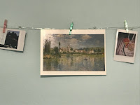
Here's a picture of some postcards in my room from my travels :-) (1 - New York City // 2 - Toronto // 3 - Perez Museum of Art in Miami // 4 - Niagara Falls // 5 - Monet Painting postcard bought at the Metropolitan Museum in New York City)


I wanted to have a sense of how the postcard should be designed. Should it be an illustration? A particular shot from the film? If it will be illustrated, what illustrative style should it be in? All these questions and more are things I've been thinking about.
Then, I came across this AMAZING DESIGN.
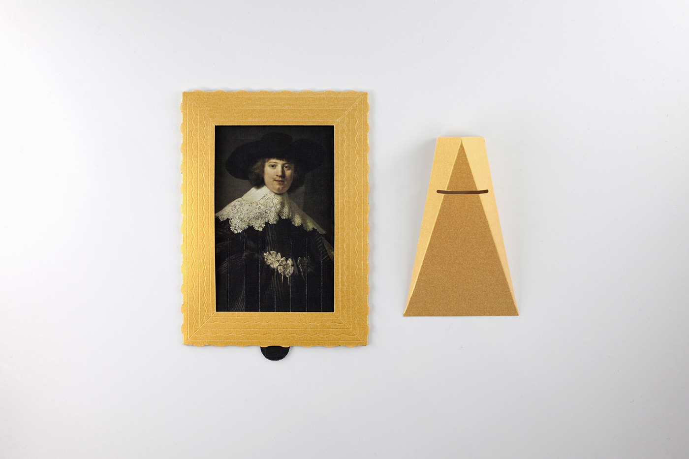
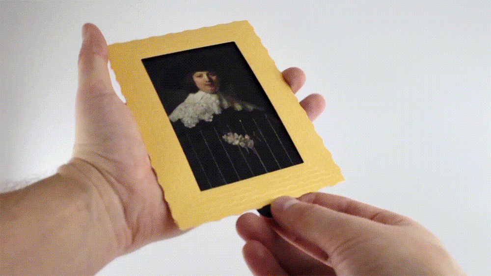
This isn't just a postcard, but a "concept card" for the Rijksmuseum in Amsterdam inspired by "the action of Banksy self-destructed 'Girl with Balloon'". The design reflects Banksy's idea to "Destroy the masterpiece and leave your message inside the postcard".
 |
| UGH!!! SO COOL! POSTED AND CREATED BY LESHA LIMONOV |
This postcard is my favorite description of the design of anything: INTERACTIVE!!!!!! It beautifully shows one of Banksy's concepts with a fun design that allows one to put the concept into action. There is also a way to display it as well for the receiver of the postcard!
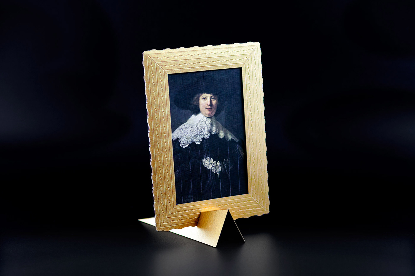 |
| Banksy should be so proud. |
This got my mind rolling and I asked myself: What can I incorporate into the design of my postcard? I think if there was a way to design the postcard in a way the receiver can interact with it, it would better market the film by providing possible audiences a keepsake that holds more meaning than just in the image it portrays.
Additionally, I just came back from canvassing for a political candidate where I had to give people a small postcard-sized piece of paper (which got me thinking about postcards in the first place) that gave details on the candidate's policies and message. I found myself cringing whenever I had to leave the paper with them because I assumed they would just throw them away if they weren't interested in learning about the candidate. If we make the postcard more interactive, like the artist did with the Banksy inspired one, perhaps we can lengthen the lifespan of it in the receiver's life.
Well, what are the ways we interact with paper anyway?
✎ COLORING
One idea I had is to make our postcard a blank, black-lined illustration of different aspects of the film, which makes it colorable! This could reflect how the film is from the perspective of a child, putting the receiver of the postcard in that innocent perspective as well by requiring them to interact with the postcard in a "childish" way.
I'm sure adults color, I mean adults who work in art do it all the time, but there is something about coloring an illustration that is so calming and comforting to me and I'm sure many others. As we wrote in the most recent draft of the script (can be found in my last blog post), there is a major scene in which the child can be seen making a birthday card, and is looking for a red crayon in particular. Maybe the illustration can be of the birthday card that the Child had created, and it can be sent out or given to people at a film festival with, you guessed it, a red crayon.
✄ ORIGAMI/PAPER MODELS
Ah, another idea reflecting another activity I did as a child. I have fond memories of creating paper models out of print outs I had of adventure time characters by folding and gluing little parts together and creating origami cranes in elementary school during my free time. Depending on what the toy we use in the film looks like for the present (which Joey and I will go shopping for in the next week so keep a lookout for that post), we can create a sort of geometrical design (maybe with a different illustration of a setting or character in each shape) that can be folded and made to look like the item. If we break down the general shape of the prop into flat shapes, this isn't as impossible as it sounds.
-------
Both of these ideas represent an essential item of the story and gets to reflect the innocent perspective the story will be told in. I can do either one, both, or none! Here's that wonderful indecision again. I will get feedback from my partner and my classmates and update you on the production of this postcard!
Comments
Post a Comment